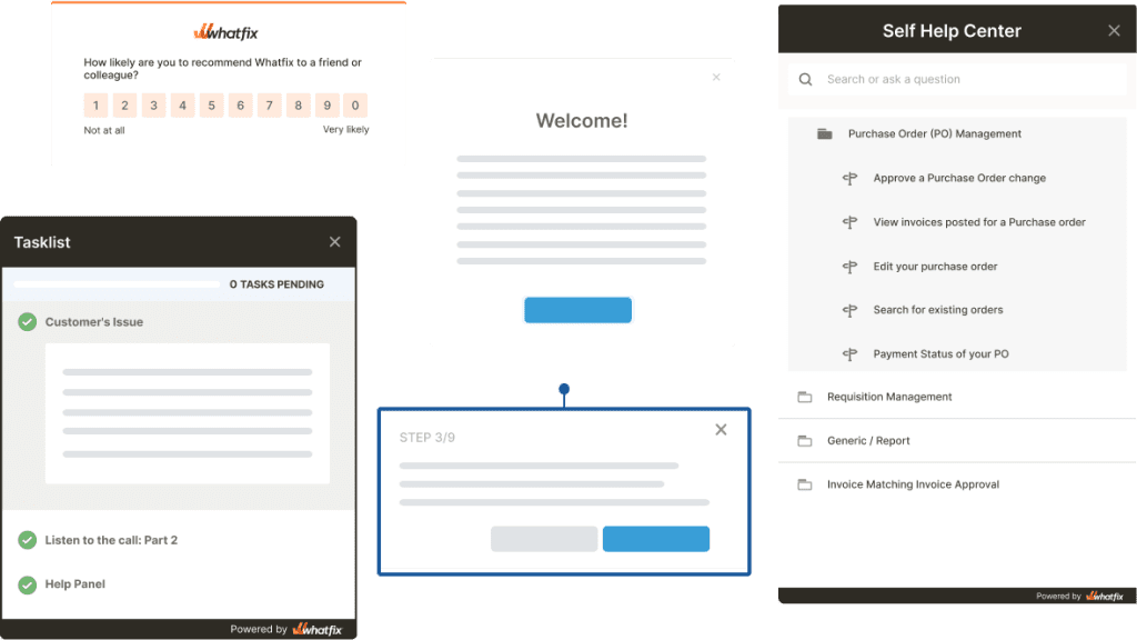

A modal window is a powerful tool. It commands attention and prompts users to take action.
But with great power comes great responsibility. Modal windows should provide relevant and specific information and encourage user participation; otherwise, they will frustrate and alienate your users. This guide will show you how to create user-friendly modal windows with tips, best practices, and examples.
What Is a Modal Window?
Modal windows get their name from the fact that they create a mode that disables the main page, yet keeps it visible beneath the modal. They are also commonly referred to as pop-up modal windows, modal dialogs, modal boxes, or just modals.
Modal windows are usually triggered by a user action such as a click of a mouse or a keyboard tap, and they intentionally disrupt a user’s workflow. Everything behind the modal is typically darkened, blurred, or partially obscured. This allows users to maintain the context of their tasks without getting confused or lost in their workflow. Users can only return to the main page if they interact with the modal or close it. But once they do, they can pick up right where they left off.
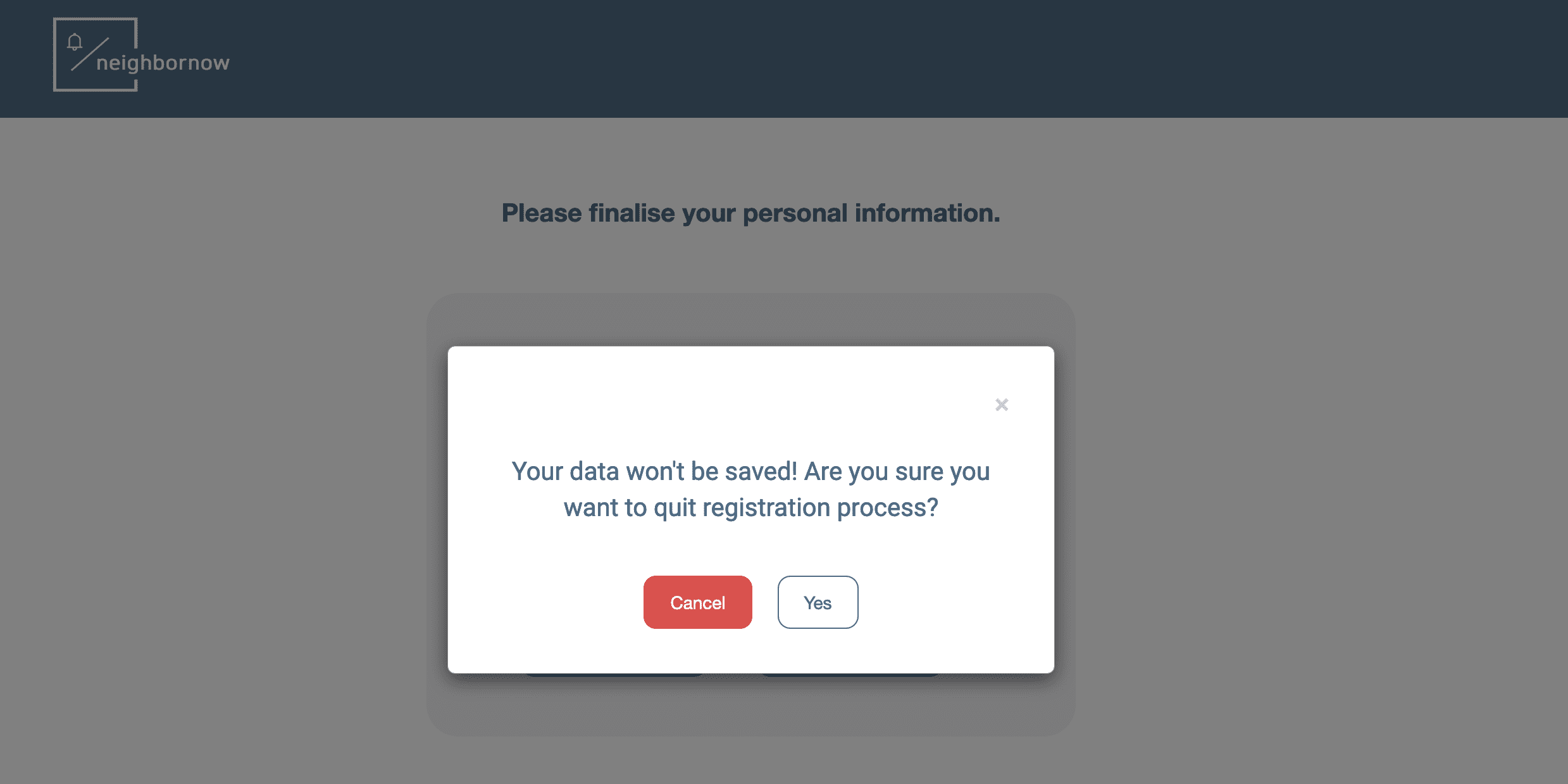
Above: Example of a modal window
When Is the Right Time to Use Modal Dialog Windows?
Modal windows are a great way to grab users’ attention and compel them to take action. Here are a few ways you can use them to notify your users of important information.
1. User onboarding
Modal windows are often used during the user onboarding phase to welcome new users and introduce product features. They can also be used to segment users and personalize their onboarding flow based on their needs.
Soapbox is a free Chrome extension from Wistia that lets users record screen captures while showing their faces. In this user onboarding example (seen below), users are welcomed by a modal window when they first log in that asks them a few questions about their objectives. And then, in the same window, users are also shown visual tips on how the app works.
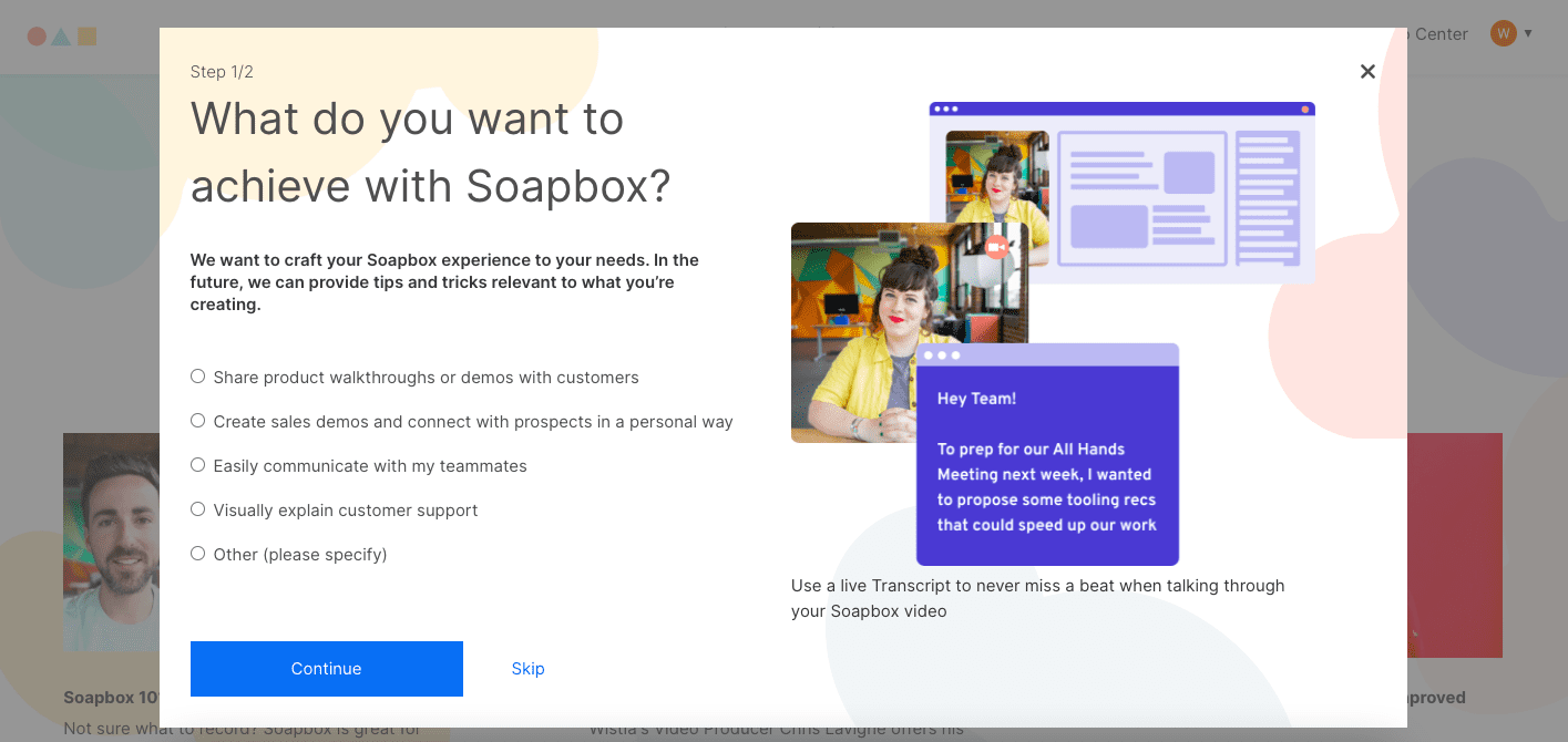
The modal effectively onboard new users by highlighting key features while at the same time asking questions that will help provide a more personalized user experience.
In another example seen below, you can see a modal window is presented to new Salesforce Lightning users. This dialog popup window presents users with a video when first entering the app – and then takes users on an onboarding flow throughout the app.
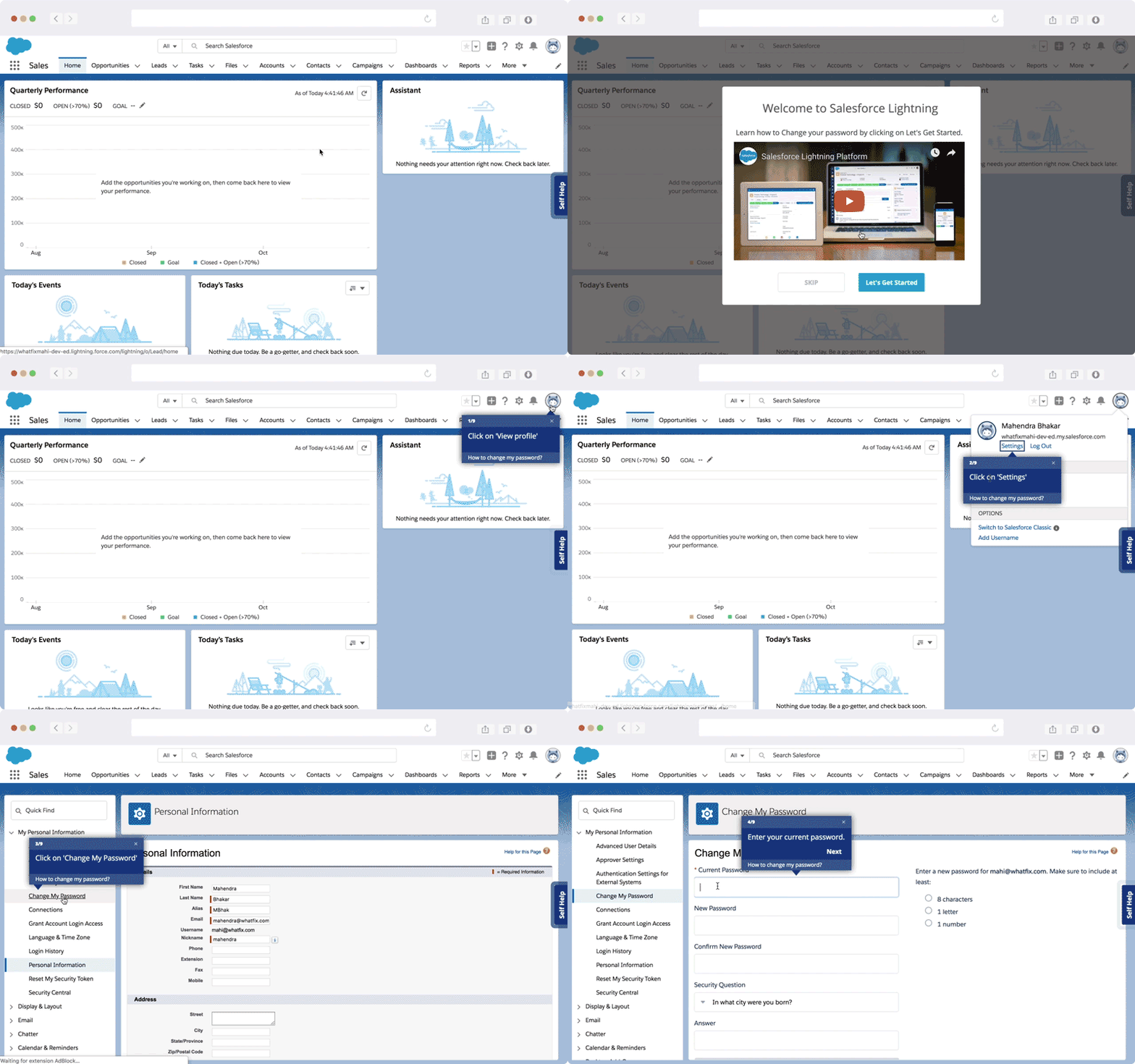
Above: Example of a new user onboarding flow created using Whatfix’s user onboarding solution.
2. New feature launches
When communicating with existing users, modal windows are a great way to highlight and launch new features, updates, or product redesigns.
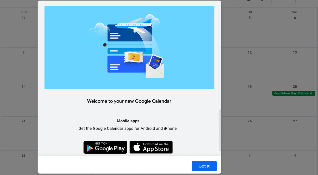
For example, when Google updated the look of its Calendar in 2017, a modal window let users know about the changes.
A noticeable but straightforward “Got it” button lets users close the window and immediately start using the app without any further interruptions.
3. Warnings and alerts
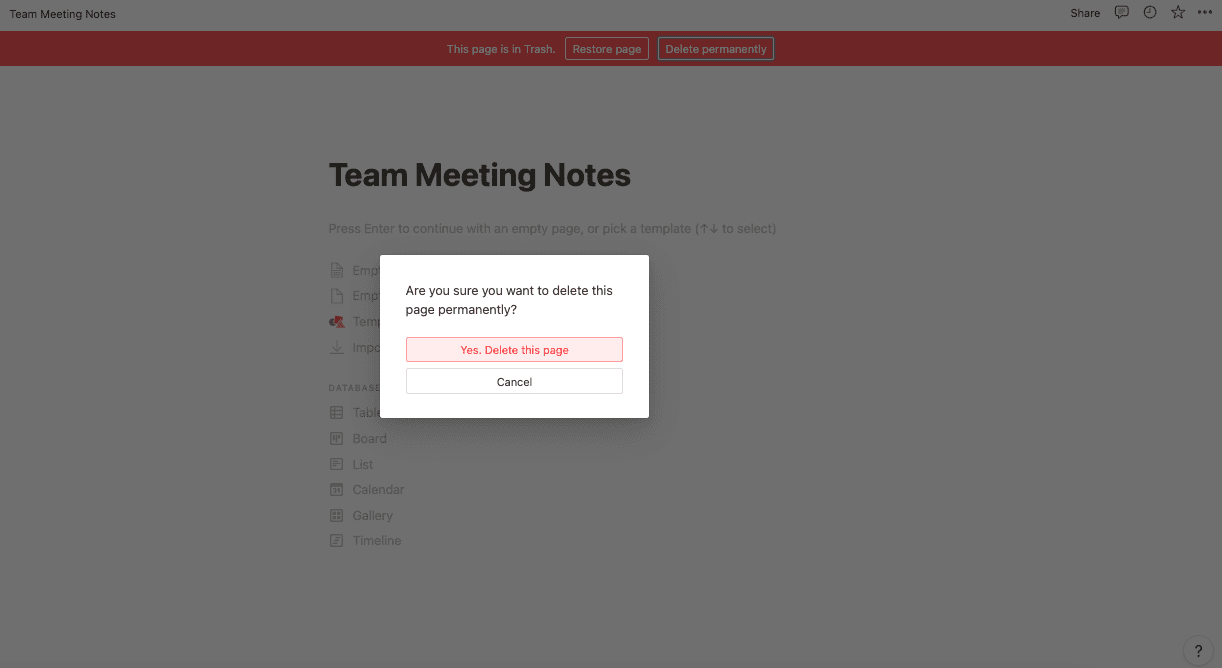
A modal can contain a warning or a notification that alerts users of the consequences of the action they are about to take, especially when the action can’t be undone or might lead to the loss of valuable or unsaved data. The task is completed only when the user has provided confirmation.
For example, with the note-taking and project management app, Notion, a modal window prevents users from deleting anything from their trash until they hit the confirm button. The modal clearly and succinctly warns the users and helps eliminate any costly mistakes.
9 UX Tips for Using Modal Windows Correctly (+Examples)
You’re already on thin ice when you interrupt users and force them to take action, so don’t create a bad experience for them with a poorly designed modal. Create modals that provide fast, focused, and contextual interaction.
1. Use a clear and descriptive title
Your modal title should clearly and concisely state the intention of the modal. Leave any explanations for what to do in the dialog.
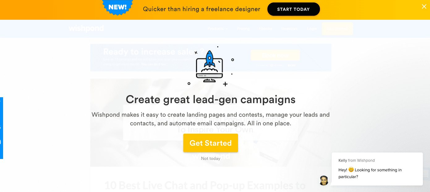
Wishpond uses a clear and short title to tell users exactly what they can do—create great lead-gen campaigns—if they create an account on its lead generation and marketing automation platform.
2. Write clear and concise body copy
Don’t beat around the bush. Clearly explain to your users what action you would like them to take so that they can quickly get back to using your app.
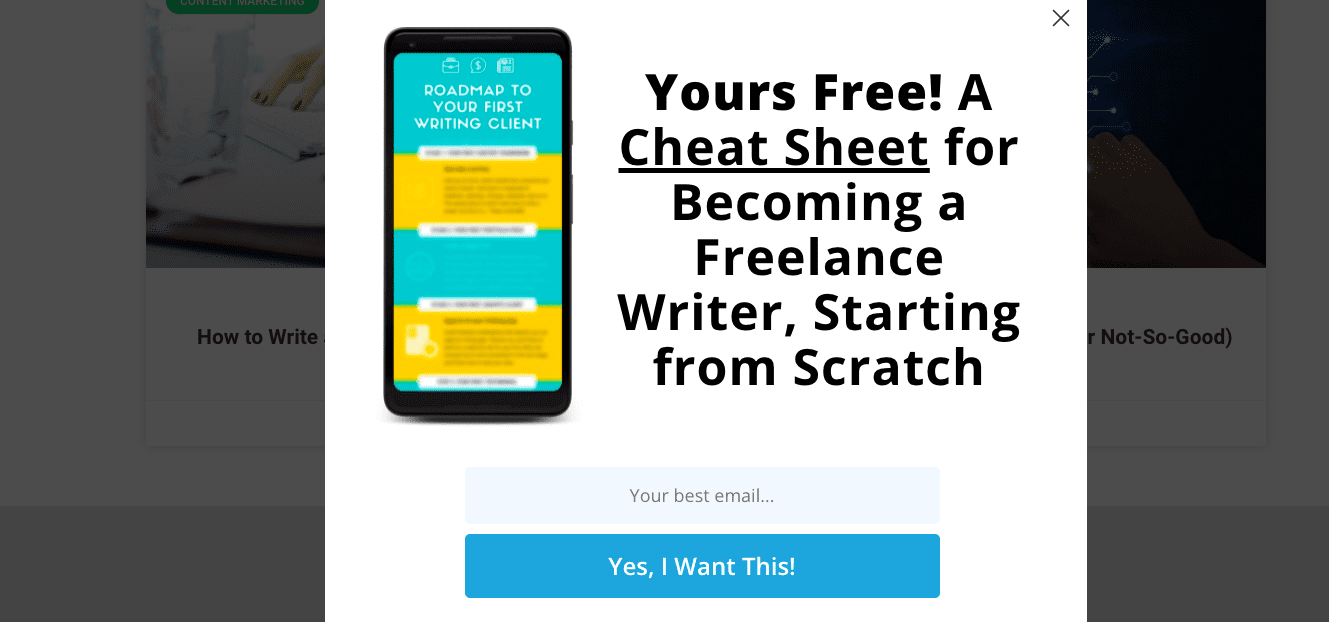
For example, Smart Blogger tells users if they provide their email addresses, they’ll receive a free cheat sheet for becoming a freelance writer. The user even sees a preview of the content.
3. Include a direct CTA
Modal windows should stop users in their tracks. But to ensure they take action, write a strong and clear CTA.
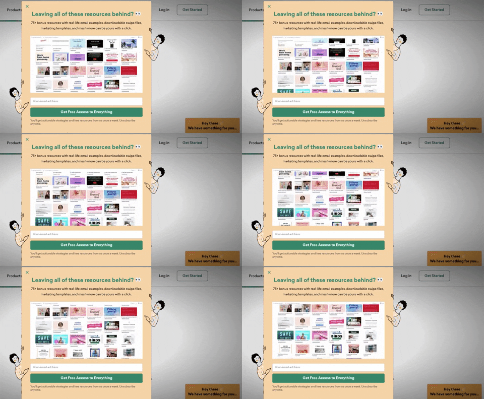
For example, the pop-up builder Sleeknote has a CTA with simple text that promises its users “Free Access to Everything.” The CTA also stands out with a distinctive green button.
4. Limit actions to one task
With modals, the key is to get your users to spend as little time on the window as possible. So keep it simple, and avoid using a modal that requires a user to perform too many actions.
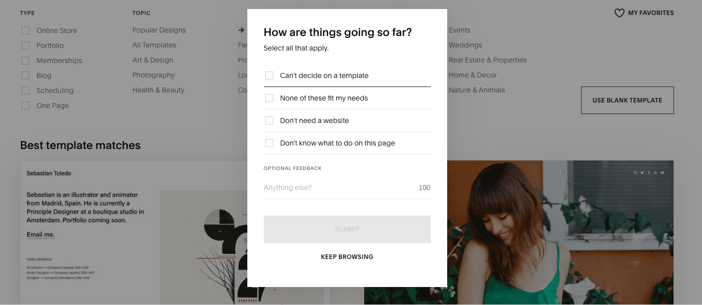
Squarespace has a simple checklist to collect user feedback. In seconds, users can select an option and then proceed with minimum interruption to their workflow.
5. Give users an obvious exit
Make it easy for users to exit the modal quickly so that they can return to using your website or app. Common ways to do this include placing an “x,” “no thanks,” or a close button in the modal.
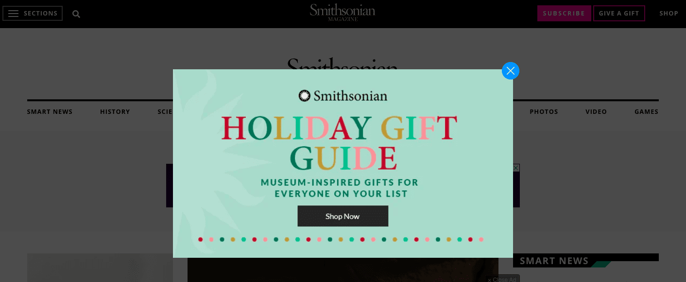
For example, users can easily see and click the x button, hit the escape key, or click outside the modal to continue browsing the Smithsonian Magazine’s website.
6. Properly size the window
Your modal shouldn’t be so large that it takes up the whole screen. But it shouldn’t be too small either. Remember, its purpose is to grab your users’ attention.
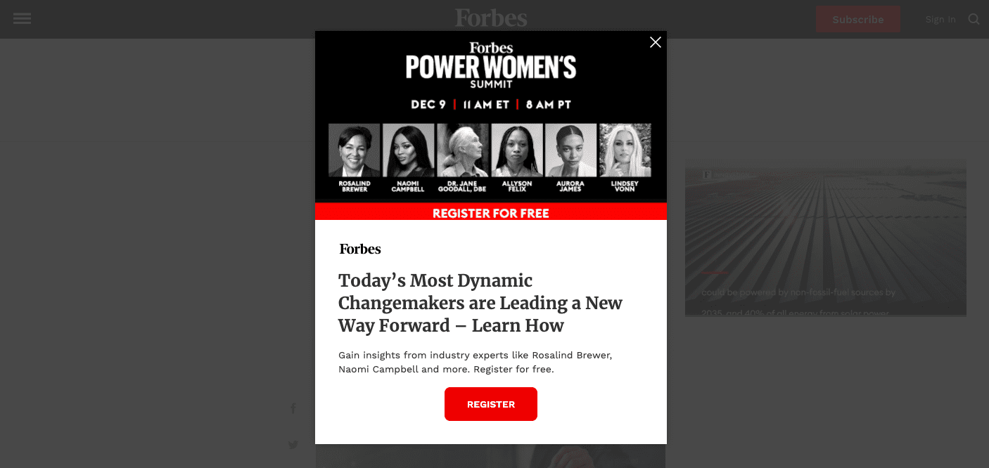
Forbes expertly used a modal window to advertise its Power Women’s Summit that was big enough to command attention and small enough so users could quickly close it and return to scrolling.
7. Implement user-initiated modals
User-initiated modal dialogs are triggered when users perform a specific action, such as clicking a link or button. Because the dialog appears as part of the workflow, user-initiated modals are less likely to surprise or annoy your users.
Contrast that with system-initiated modals—such as an ad that pops up randomly—and you can see how user-initiated modals work better.
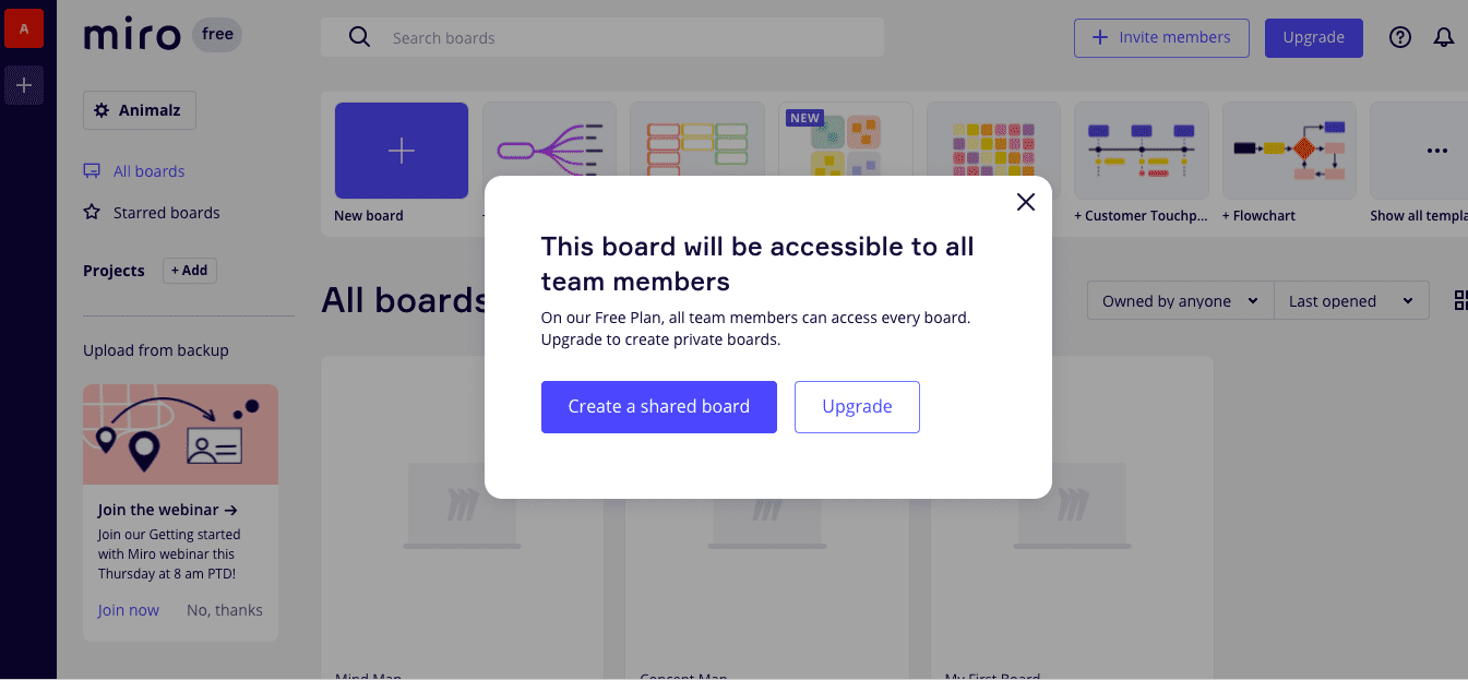
Miro, an online collaborative whiteboard platform, has a user-initiated modal that is triggered when accessing a feature that is only available to premium members. The modal is non-intrusive since it appears in the middle of a user’s workflow, and the user can choose to either upgrade their plan or continue working without the extra feature.
8. Render background elements temporarily inaccessible
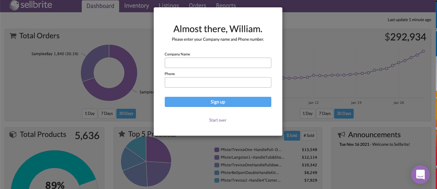
To emphasize the modal, use an overlay and restrict access to the background page. Your overlay should be dark enough to draw the user’s attention to the modal but light enough so that they can still see the page they were on.
For example, when onboarding new users, Sellbrite uses a dark gray overlay on their welcome page that gives users a peek into their app—while keeping them focused on the modal in front of them.
9. Keep it simple
Try not to overdo it by cramming too much in the box. Instead, keep your modal content clear and simple. If you find yourself putting too much in the window, that’s a sign that you may need an alternate design solution.
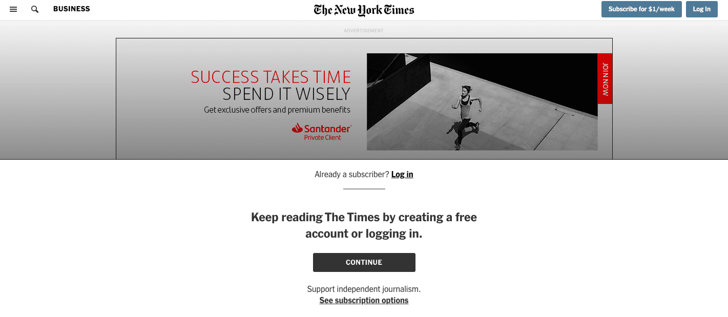
The New York Times hits all the marks and still crafted a simple user-initiated dialog—with a minimalist design, short title, concise modal body copy, and a clear CTA.
20 Best Plugins & Tools to Create Modal Popup Windows
While you can build basic modal windows into your site with CSS and HTML, that may not be the most accessible strategy.
With Whatfix, you can build code-free modal windows—and other in-app messaging UX elements such as tooltips, interactive walkthroughs, product tours, embedded self-help widgets, and more. Whatfix makes it easy to create these customizable interactive elements to improve your user onboarding, product adoption, and overall user experience—without waiting for your product team to add it to the roadmap.
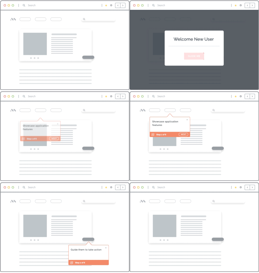
However, if you prefer to build your modals in-house, we understand. Here are 20 of the most popular open-source plugins for creating modal pop-up windows:
1. Tingle
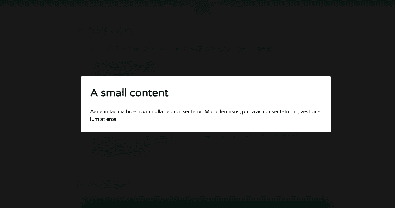
Built entirely in JavaScript, Tingle has no dependencies, is fully customizable via CSS, and has a simple API. Tingle is also created with UX in mind, so it’s responsive and works on both mobile devices and desktops.
2. Vanilla Modal
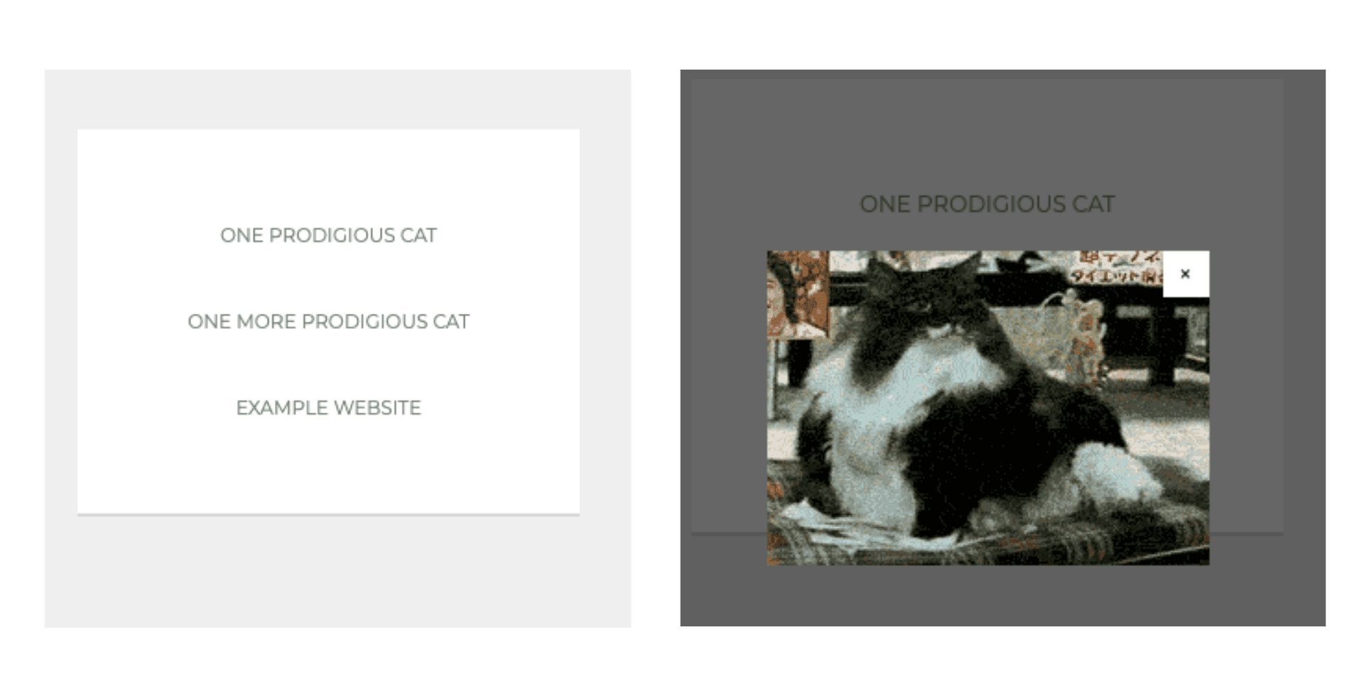
As the name suggests, Vanilla Modal runs on pure vanilla JavaScript. This simple-to-use plugin is tiny, flexible, and dependency-free. It also comes with custom CSS so you can restyle the windows.
3. jQuery Modal
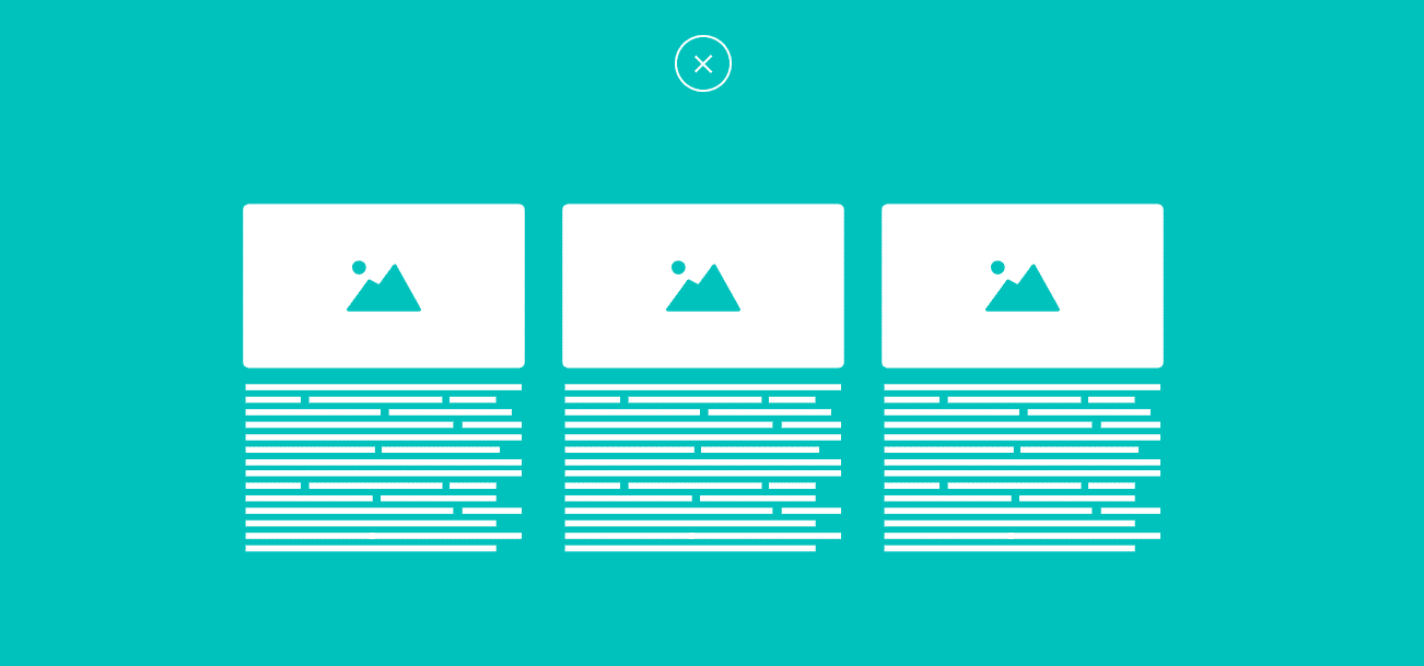
jQuery Modal provides a basic and straightforward way of displaying modals with jQuery. It is lightweight (about 1K minified) and is bare-bones (has no images). It also comes with a clean layout and minimalist design with a simple markup that makes it easy to style.

4. animatedModal.js
animatedModal.js is a jQuery plugin that allows you to create full-screen modals with CSS3 transitions. You can either create your own transitions or modify the templates from animate.css.
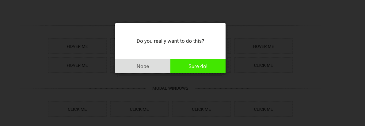
5. jBox jQuery Plugin
jBox is a flexible, modular, and robust jQuery plugin. It has a powerful library that offers a variety of options to customize the appearance and behavior of your modals. It is also responsive and super lightweight (less than 30KB when minified and gzipped).
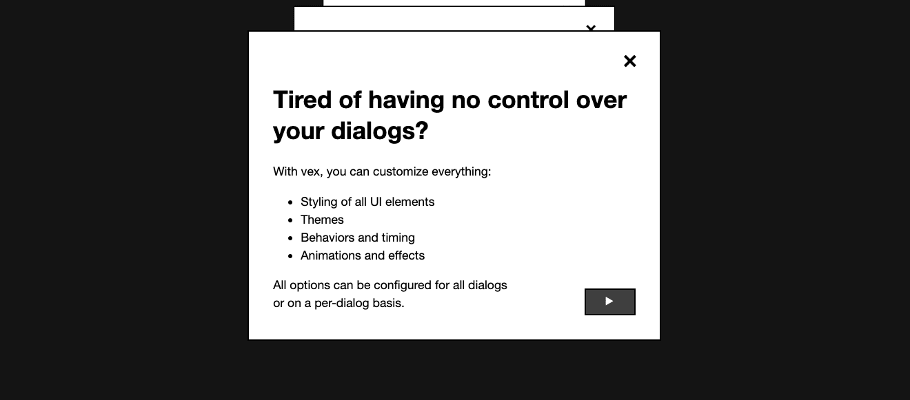
6. Vex dialogs
Vex dialogs is a mobile-friendly JavaScript modal library with a simple API. It’s lightweight (~2KB minifed and gzipped), highly configurable, and comes with customizable animations, overlay styles, and more.
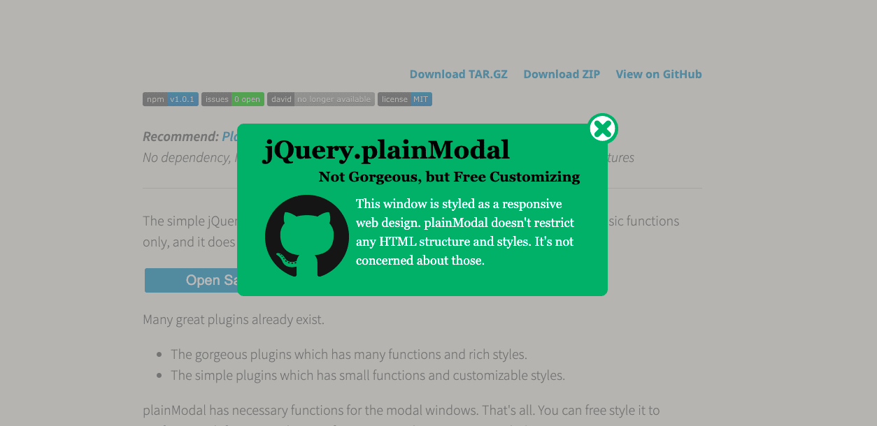
7. plainModal
The plainModal jQuery plugin has one of the smallest modal scripts available. It’s easy to use because it’s just one file and has no image or CSS files. It also has zero dependencies and comes with basic functions that you can style to match your webpage.
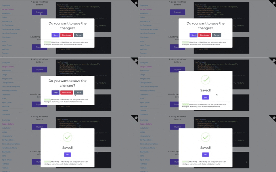
8. SweetAlert2
SweetAlert2 is a beautifully designed JavaScript library that is simple to set up and use. It has zero dependencies, and its modals are easy to customize, responsive, and fully accessible based on WAI-ARIA standards.
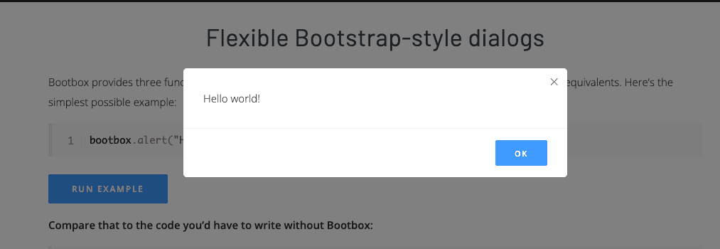
9. Bootbox.js
Bootbox.js is a small JavaScript library that allows you to create programmatic dialog boxes using Bootstrap modals. It requires no HTML coding, and customization is available for button types, inputs, drop-downs, etc.
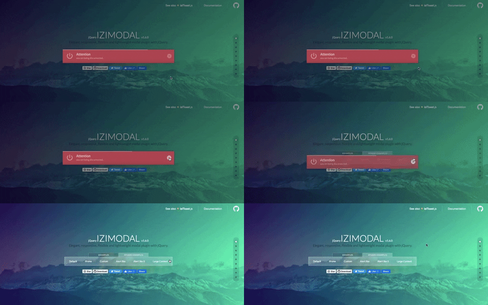
10. iziModal.js
iziModal.js is an alternative jQuery dialog that generates modals easily with different styles for several purposes. It’s responsive, fully customizable, and easy to set up and use.
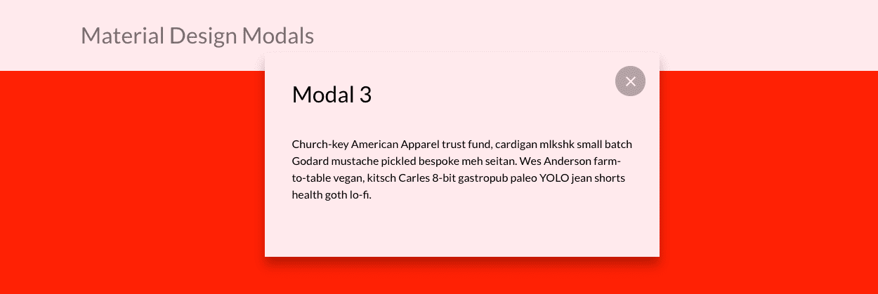
11. Responsive Material Design Modals
Responsive Material Design Modals is a slick responsive modal built with CSS and JavaScript. It’s easy to use, has a small library, and requires no jQuery.
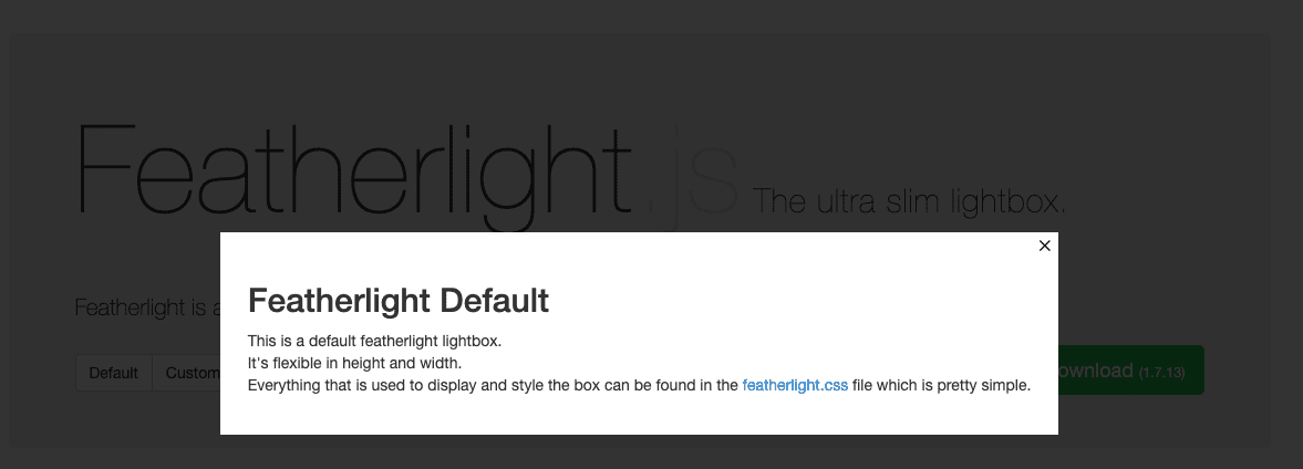
12. featherlight.js
True to its name, featherlight.js is lightweight; 400 lines of JavaScript, 100 of CSS, less than 6KB combined. It’s smart, responsive, and supports images, Ajax, and iframes. It also requires little code and is easy to customize based on your needs.
13. PicoModal
PicoModal runs on plain JavaScript. It’s small (around 2KB minified and gzipped), self-contained (no extra CSS or images required), and has no dependencies. The user interface is simple to use, and by changing a few settings, you can customize the default styles and behavior.
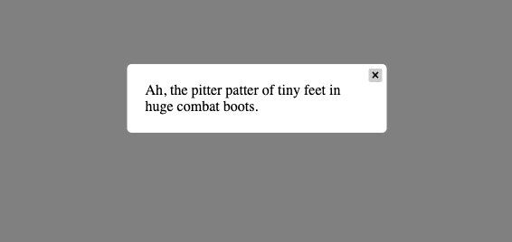
14. Modal.js for Bootstrap
With Modal.js for Bootstrap, the modals are built with HTML, CSS, and JavaScript. The modals are streamlined but flexible and require minimum functionality. It also has a simple API, so you don’t need to code any JavaScript.
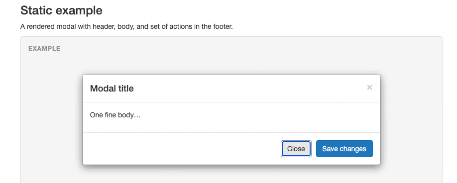
15. Avgrund
Avgrund is a simple vanilla jQuery Modal plugin. It’s easy to set up, with just CSS, a JavaScript file, and custom animations.
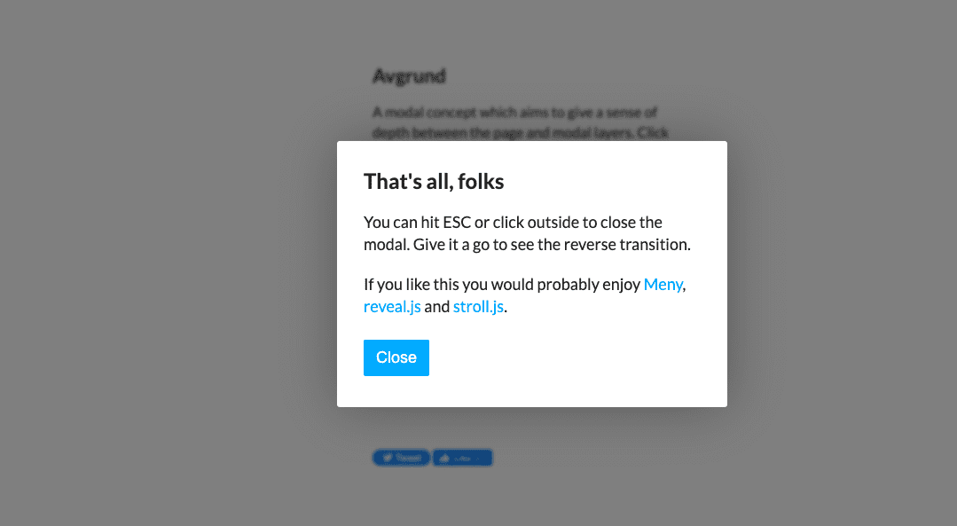
16. Modaal
Modaal is a WCAG 2.0 accessible modal plugin built on CSS and jQuery. This responsive plugin provides many features for flexibility and accessibility and has been optimized for assistive technologies and screen readers. It also comes with ARIA support and is set up to require as little customization as possible.
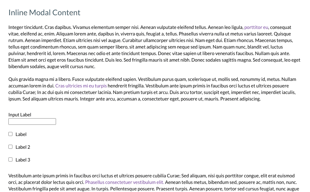
17. Boardal — An Onboarding Modal with Vue.js
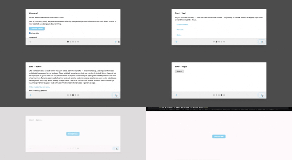
Boardal is a JavaScript modal plugin that’s custom-built for step-by-step step user onboarding. It includes options for presenting screens horizontally or vertically within a modal.
18. ARIA-modal
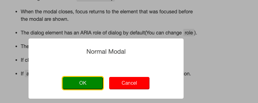
Aria-modal is a no-frills, bare-bones, and easy-to-implement plugin that’s built on TypeScript, JavaScript, HTML, and CSS. It’s also built according to WAI-ARIA Authoring Practices.
19. Morphing Modal
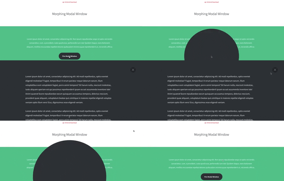
Morphing Modal is an easy-to-set-up and customize modal plugin. It’s powered by a combination of CSS transition and transformations, jQuery, and Velocity. When a user clicks a CTA button, it triggers a full-width modal window.
20. Flexbox-based modals
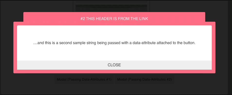
Flexbox-based modals are built on CSS and jQuery and are simple, responsive, easy to integrate and extend, and do not rely on any libraries.
Whether you choose to go with Whatfix to build your modal windows or any of the plugins we mentioned above, make sure to use them sparingly and with strong intention. While there are some instances where you’ll need to grab your users’ attention, try not to do it at the expense of user experience. Be tactical in using them to improve your UX, onboard users better, call out new features, and alert users of errors.
Ready to learn more? Get started with Whatfix now!

